Showing posts with label impresa. Show all posts

Sunday, April 29, 2012

Tournament shield is complete

It was supposed to be a quick project, but it hasn't exactly been that. It has been an interesting and educational one though and I'm really glad I decided to make this.

The sanding didn't go as well as I'd hoped and I ended up having to rebuild the bottom set of points after they broke off. I also ended up adding a wood filler to the entire piece when the papier mache just wouldn't smooth and sand. I also added a bit of dimensionality to the cornucopia at the advice of my friend Marguerite. Sculpting with wood filler isn't exactly the best of ideas, in case you were wondering.

I spent some time reading  Cennino Cennini's Il Libro dell'Arte just because this is one of those interesting sorts of projects that artists would be called upon to do. Banners, embroidery designs, tournament shields, textile printing; it all had to be in the repertoire of the painter. I find the flexibility and scope fascinating.

The word impresa and the first emblem books are Italian, but my specific portrait reference is not, so I wanted to add a bit more Italian feel to my shield, so I referenced maiolica pieces when I added the scrollwork.

The piece I was most drawn to was this bowl by Maestro Giorgio Andreoli in the Metropolitan Museum of Art. Dated 1530. The hearts, flourishes and scrolls are lovely as are the colors. I also like the putto with his pinwheel. Perhaps it is because I love toys, I'm not really sure.

The colors of maiolica with the bright blues and yellows really appeal to me and let me go a little nuts on the shield. I felt it was only fitting with a motto meaning "More is Better" that more be involved. The cornucopia was just a little too plain. I also added the Greek version of my name "Parascovia" on the horn itself.

I feel ready for battle now. On, on, to the couch to continue couching the cappotto. (It just doesn't have the excitement of a charge, does it?)

Wednesday, April 18, 2012

Impresa for the tourney shield


My impresa came together pretty quickly. I knew I wanted something very clearly rooted in the emblem books, rather silly, and totally appropriate to my current "tournament." I also wanted to very clearly follow Paolo Giovio's "Rules" for making an impresa from his 1559 Dialogo dell'imprese as listed by Ursula George after Alan Young's Translation in The English Tournament Impresa.

" There should be a proper proportion between soul and body [motto and picture].
The impresa should be neither so obscure that the Sibyl must interpret it, nor so obvious that every plebeian can understand it.
It should have a beautiful appearance, making use of stars, the sun, the moon, fire, water, green trees, mechanical instruments, strange animals, and fantastic birds.
It should contain no human form.
It should have a motto, which is the soul of the body, and should be expressed in a language other than the native language of the bearer, so that the meaning may be more obscure.
The motto should be brief, but not so much that it creates uncertainty. Two or three words may be enough, unless they are in the form of verse. "

I also wanted something that fit Praksedys' persona (the personality, not the Russian place and time) so I could possibly use it at a future point in the SCA. Between my tendency to create quantity and embrace color and Praksedys' love of pearls and over the top decoration, I settled on the concept of positive excess. Throwing a few wording options into translation software in a variety of languages and picking the one with the best ring to it gave me "Magis est Melius," the Latin for More is Better.

I had already been gifted with the idea for the perfect symbol by my friend Dame Kadrina Tanskalainen after she took my impresa class and was then forced to brainstorm about this on the way home since she had been my travel buddy to Collegium. A cornucopia seemed rather perfect. How perfect I didn't quite realize until I dug a little.

Abondanza, Abundance/Plenty, with her cornucopia is the very first emblem in Cesare Ripa's Iconologia, an emblem book first published in 1593. The symbol is as Classical as they come, often attached to a variety of Roman Ggoddesses or Dionysus on occasion. One of the original myths has it being created from a horn ripped by Zeus accidentally from his nannygoat wetnurse Amalthea. To make it up to her, he insured that it will always be full of the best foods for her.

There is a double cornucopia in the emblem for Fortune in Alciato's Book of Emblem's as well. It turns up constantly in decorative art and allegory. It has a solid pedigree for use in imprese all around.

So, I have a 3 word motto in Latin with a mythological symbol full of nature. Check, check, and check. If I draw it without the goddess we're clear on the no human figure (the rule is often ignored, but I was trying to be a good kid and follow it.) Balance is subjective, but it seems pretty reasonably matched, and because of the circumstance, the motto seemed pretty clear. Add a couple more checks and I think the rules are fulfilled. I should probably write a poem or compose a song just to be thorough, but visually the impresa is complete.

I'll get a scan of my drawing tomorrow. Hopefully, the shield will be done drying by then and I can start prepping it for paint.

In other news, I have finished the swatch for my knitted stockings so I can calculate the pattern. I also think I've settled on a camicia style. I'm going to put off the black pointed project until later. I want to do this dress next, and that camicia will be nice for that project I think.

Tuesday, April 17, 2012

Tournament shield in progress

After spending all the time researching impresa for my Collegium class I decided I really needed one. Also, possibly a tournament shield. Because it would be fun. Not to mention the fact that it would look awesome on my sewing room wall. Since I'm not doing bunches of fighting just yet, this is the type of tournament I enter just now. Additionally, I really liked the banner Christa Gordon made last year for the IRCC to take her pictures against. I think it added a great deal to the look of the presentation and it also made it really nifty to see her heraldry displayed that way and then find the bits of it used in the dress. Not sure that it counts towards my final point total, but it makes me happy anyway, so I'm making one.

I really love the tournament shield in this portrait of George Clifford, Earl of Cumberland as Queen's Champion to Elizabeth I (image is from Wikipedia.) The flourishes and fact that it is absolutely in no way functional make it so much better. The shape is also seen in Alciato's Book of Emblems which is the first of the published impresa. Here it is in emblem 19, an owl with the motto Prudens magis quam loquax "Wise but not wordy."

Tournament shields like this are meant to be ephemeral, and are made of papier mache or similar materials. There is a surviving pageant shield from 1470 in the Louvre by Antonio Pollaiuolo. It is carved gesso with guilding. Sort of like stucco built over an armature.

I decided to make mine from papier mache. As I intended it to hang on my wall, I wanted to keep the shape of the one in the painting of Clifford, but chose to only bend it forward, rather than having back curving sections as the one in the portrait appears to have.

I started by sketching my shape and cutting it out of brown paper to trace it on to the cardboard I was using as a base.

After cutting the cardboard to shape, I built a little bit of an armature from tin foil so I could build up the center for the dimensionality I wanted.

Then it was just a matter of covering it with papier mache and sculpting the shape I wanted. I used Celluclay, as I have previously used the product successfully. I know there are several other similar products on the market and I certainly could have made my own mixture, but I don't have much waste paper hanging around so I went with what was easy.


I just used my hands for the sculpting, no fancy tools involved. You'll notice the other fancy equipment-- I let this dry on my husband's desk and used some of his soda cans to prop up the edges so that they would curve properly.

It is going to take a few days for the papier mache to dry. Then I will sand it, prime it and begin painting and gilding.

Wednesday, April 11, 2012

Spent the day working on my Impresa class


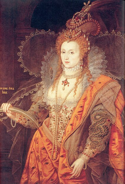
You gotta love the Rainbow Portrait. Elizabeth I in masque costume declaring that there are no rainbows without the sun. Herself, of course, being the sun.

I became entranced by emblems and impresa and other types of badges and temporary heraldry ages ago, but Michael Bath's book Emblems for a Queen about the emblems in Mary Queen of Scots embroideries really solidified my fascination. Ursula George's article on Impresa convinced me I needed to devise my own and spread the word so other people would make them too. The class I'm teaching follows along with her article pretty closely. It's just that good, clear, and concise. My presentation has several of the portraits she links to, a generous selection of my favorite emblems from Alciato's Book of Emblems (I love the fact that you can put the Latin and English on facing pages for comparison) and another big helping of images from Claude Paradin's Emblems Heroiques (the English translation)

If you have any desire to read my goofy newletter article introducing impresa, particularly in reference to Mary's embroideries, you can read it here. One more class to add to my A&S 50 challenge.